Neil & Partners
Architecture/ Interior
Website Design
UAE
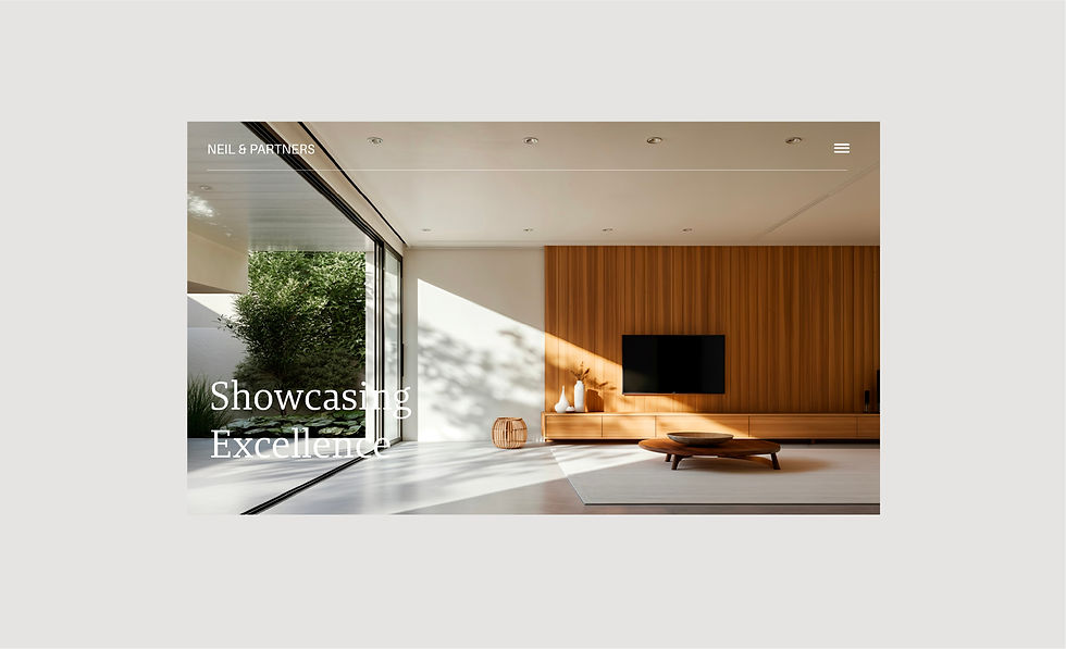
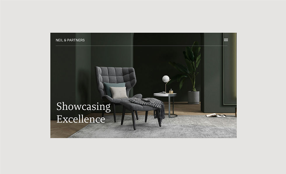
Minimalism becomes the canvas, every scroll, transition, and interaction reflects the brand’s ethos: beauty through simplicity. The architecture of the site mirrors the architecture of their spaces, letting the work do the talking while you navigate effortlessly.


Summary
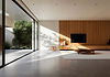
A Website as Curated as the Spaces They Design
Challenge
We needed more than a digital brochure, we had to convey a seductive sense of space, elegance, and attention to detail. The challenge was to evoke the tactile, sensory world of high-end interiors through screens, creating atmosphere without physical presence.


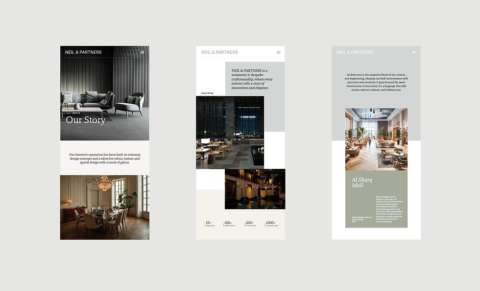
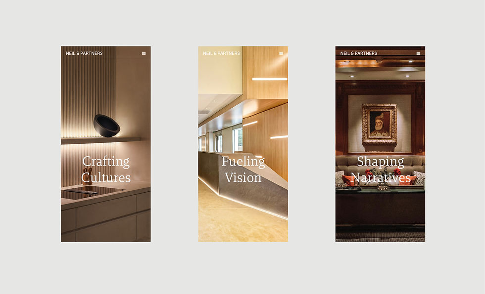
The foundation of the website lies in a strict, architectural grid, providing balance, clarity, and structure. But within that framework, we introduced free-floating elements and text boxes that break symmetry intentionally, adding a raw, editorial edge. No two pages are alike; each layout reflects the individuality of Neil & Partners’ projects. Yet, through cohesive typography, color, and spatial rhythm, every page feels like it belongs to the same refined, visual family.


We translated Neil & Partners’ design philosophy into a digital narrative rooted in restraint and refinement. The result is a website that feels like entering a curated gallery, quietly confident, concept-driven, and unmistakably sophisticated.